Some time ago, while teaching a scratchboard class, I realized that “art is an illusion”. I’m certain that this is something I have always known at a subconscious level, but the actual words came to me during that class. It just clicked that we were not drawing dogs, cats, flowers or whatever, but we were making marks on a board that represented these subjects.
My latest drawing of Arabian mare Tani Tabriz (“Breezy”) is a good example of this concept. It’s not a real horse, it’s not a photo, it’s pencil marks and shading arranged to look like a horse. Granted, it takes a level of skill and understanding of the process to know where to put the marks and how to apply them. It also requires a knowledge of the subject (an awareness of the physical structure) to understand how the light and dark areas work together to accurately create the illusion of shape and depth.
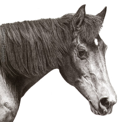
“Tani Tabriz”, 7″ x 7″, Graphite Pencil on Stonehenge Paper
When I start a drawing or painting, I take the reference photo, scale it to the size of the finished piece and transfer the basic outlines & shapes to my paper or board. Some might say “that’s cheating”, but I see it as a shortcut that saves me time so I can get to the “meat” of the drawing or painting. I won’t launch into the full discussion of that here (as I do when I teach classes), but what I find interesting about art is that I could give that transferred image to 10 different artists and there would be 10 different results. Each artist has their own way of interpreting what they see and their own method of recreating it. Each artist has to make judgment calls on what to include or leave out in order to get the effect they want.
Look at the details of Breezy’s eye & muzzle regions. Instead of seeing these areas as an eye and nose, see them as a number of shapes/shaded areas. Circles, lines, wedges and arcs of different values come together to create the illusion of an eye, nostril, cheek, vein, bony ridge, etc.
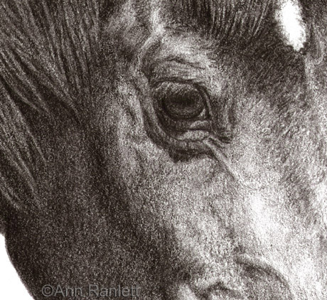
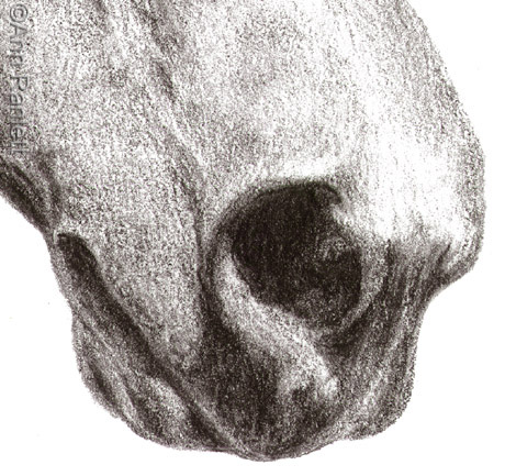
Well, that’s my little discussion of the illusion of art. Feel free to comment with your thoughts.
Below is the reference photo of Breezy (in color & greyscale). If you’d like to see scans of earlier stages of the drawing, click here for a previous blog post.
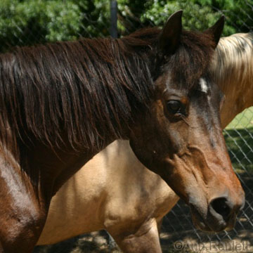
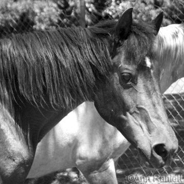
I converted the color photo to greyscale, increased the contrast and lightened it a bit.


Pingback: Thoughts on Learning Scratchboard | Ann Ranlett, MSA